The Material Decision That Changes a Work's Surface
See how material choice changes a work’s surface, from the way it catches light to the mood it gives an object in a gallery or studio.
Why can two objects with the same outline feel so different to look at? Often, the answer is the material choice: one surface absorbs light and invites a close look, while another reflects it and makes the object seem crisp or distant. The material is not just what a work is made from. It helps decide how the work meets the eye.
That decision matters in a community workshop, a shared studio or an exhibition space. You do not need specialist tools to think it through. Start by noticing the surface you want people to see, then consider how the material’s texture, finish and colour will shape that impression.
Surface and first impression
A surface is the visible and touchable boundary of an object. It may be soft, rough, smooth, porous, glossy or uneven. These qualities affect the way a viewer reads its shape, even before they recognise what the object represents.
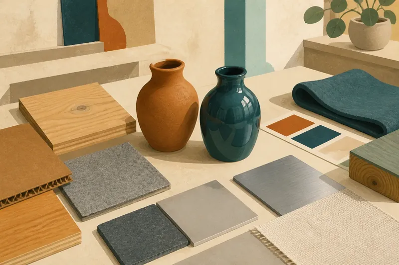
Consider a small clay vessel. Left unglazed, its matte body can make the vessel feel quiet and earthy. A glossy glaze may sharpen its silhouette and draw attention to reflected light. Neither finish is inherently more expressive; each places emphasis somewhere different.
Materials also carry familiar associations. Cardboard may suggest packing, temporary construction or play. Steel can seem firm and precise. Felt often reads as warm and yielding. These are not fixed meanings, but they can colour a viewer’s first response. A material can support an intended mood, complicate it or deliberately work against it.
Before choosing, describe the impression in plain words: soft-edged, spare, weathered or bright. That gives you a clearer test than asking whether a material is simply attractive.
Texture in changing light
Texture is not only something fingers detect. It changes what the eye notices. A ridged surface can break light into small highlights and shadows, making a form look lively. A smooth surface tends to show a more continuous reflection, which may make the same form appear cleaner or more formal.
Light in a studio differs from light in a gallery corridor or a bright community hall. A dark, rough surface may reveal its detail in angled light but appear nearly flat under dim, even lighting. A shiny surface can pick up windows, lamps and nearby colours, sometimes competing with the object itself.
When possible, look at a material sample near the place where the finished work may be seen. Turn it towards a window, then step back. The aim is not to imitate gallery conditions exactly, but to notice whether the surface still communicates the quality you care about.
Finish and material choice
Material and finish are related, but they are not the same decision. Material names the substance: wood, paper, cloth, clay or metal. Finish describes the visible character of its surface, such as polished, brushed, sealed, uncoated or painted. A finish can soften or heighten the material’s usual appearance.
For instance, plywood may show its layered edges as part of the work, or a coating may make those edges recede. Cotton can look casual when left visibly woven, while a smooth lining can make it feel more tailored. If a material is altered with paint or a coating, its original texture may still show through—or disappear beneath the new surface.
Say you are making a shallow wall piece from scrap wood for a neighbourhood arts room. You want it to feel assembled rather than factory-made. Leaving the joins and grain visible may help express that intention; a uniform opaque finish may instead direct attention to the outline. The useful question is what viewers should notice first, not which option looks most polished on its own.
Questions about surfaces?
How do I choose between matte and glossy?
Matte surfaces tend to reduce sharp reflections, while glossy ones catch brighter highlights and surrounding shapes. Think about whether you want viewers to focus on colour and form, or to notice the changing light around the object.
Does a rough surface always look handmade?
Roughness can suggest handwork, age or rawness, but context changes its meaning. A deliberately rough texture may look considered when it relates to the object’s shape or subject; it may look accidental if it draws attention away from them.
Can one object combine different materials?
Yes, and contrast can make each surface more noticeable. A fabric panel beside a rigid wooden edge, for example, creates a clear shift in texture, so consider whether that shift supports the work’s visual idea or distracts from it.
What if I cannot decide from a sample?
Place the sample beside the other materials and colours you expect to use, then view the group from the distance a visitor might stand. A surface can seem appealing alone but feel too bright, dull or busy in combination.
Making a considered choice
A simple comparison can clarify the decision without turning it into a technical exercise. Gather small offcuts, swatches or sample pieces rather than relying on material names or screen images. Set them beside the work’s main colour, and notice which qualities become more prominent.
- Light: Does the surface absorb light, reflect it or scatter it?
- Texture: Does its pattern support the object’s shape?
- Colour: Does the material’s natural tone strengthen the palette or compete with it?
- Context: Will the surface remain legible in the room where people encounter it?
- Combination: Do adjoining materials create a useful contrast or an unwanted clash?
For a finished object, also check any care or handling requirements on the product label or from its maker; follow those directions where they apply. If the work is intended for public handling, ask the venue or workshop about its own requirements.
Material choice changes a work’s surface in ways that reach beyond touch. It influences what catches the eye, how a shape feels at a glance and what associations gather around it. Keep the sample that best serves the impression you want to create, even if it is not the most dramatic one. A quieter surface can give the rest of the work room to speak.